I was looking through shelves for a subject to write about, and found the book “Exotic Alphabets and Ornament” by William Rowe, published in 1974. This work has a variety of Art Deco style alphabets and borders designed by the author.

There are some unusual alphabet designs worth reading about. It would be tough to read a book with some of these alphabets, but for advertising posters and such, it could be quite appealing. This book also gave me a point of direction on where to go next.
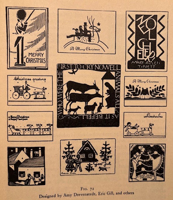
I went to “P’s and Q’s, A Book on the Art of Letter Arrangement” by Sally B. Tannahill, published in 1944. This book is a study from the basics of printing a page of words, to using words artfully with flourishes and dramatic designs.

These designs could be used for many types of work, for example the lead illustration of the first letter of the first word in a chapter, monograms, and countless examples of using letters and artwork together. It was intriguing how artwork and letters can be combined. I have several examples:

This was quite an interesting book on letters.
With curiosity, I then grabbed “A Primer In Book Production” by Frank B. Myrick, published in 1945. This book goes into the details of making a book.
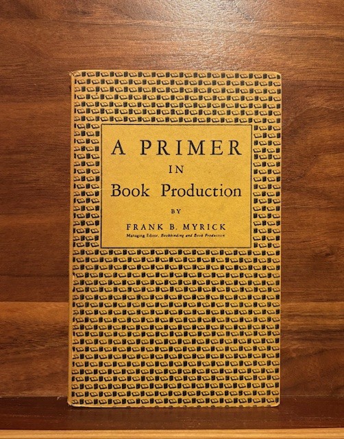
I flipped through to the chapters on print, and how letters (the type) had to be placed in line on a tray, with spacers and punctuation. Larger companies would use Linotype machines, that would have a worker type out the words of a page, and then the machine would form the metal letters in a form for an entire line. It was a one time use for those type letters. Other small time presses would set their trays with individual type letters-one letter at a time.
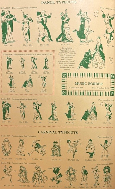
I have next ” Catalog 25-A: Type Faces, Border Designs, Typecast Ornaments, Brass Rule; Selective Specimens of Preferred Materials for Modern Typography; Superior Specialties for Printers” by the Barnhart Brothers & Spindler, published in the early 1920s.
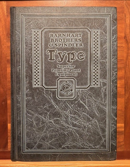
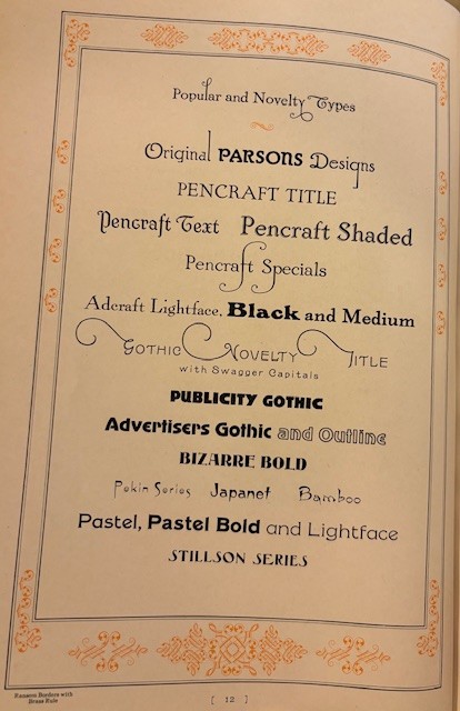
This catalog would show different types of print one could buy, along with what size letter. Many of the book’s pages would show the same printed paragraph, just in different point, or font, sizes to represent how that type would look. There were hundreds of styles of type, along with borders and illustrations. To match typewriters, there were types that mimicked all of the main brands of typewriters. There was also metals and machinery for linotype machines.

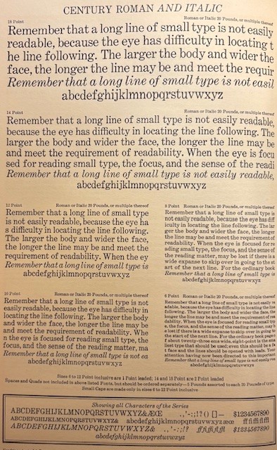
This catalog book of type was very well made and detailed, for many types of type available. There was over 550 pages, all on heavy paper, and very cleanly printed. It is still used as a textbook of style for printing today.
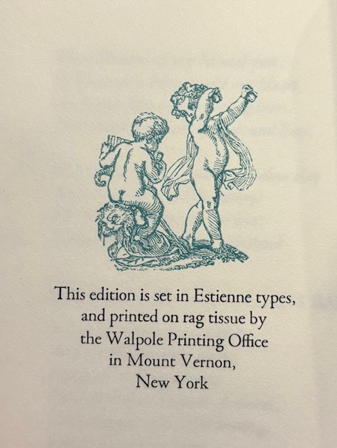
I have a collection of Peter Pauper books (this case is full of those books) published by Peter Beilenson, creator of Peter Pauper Press.
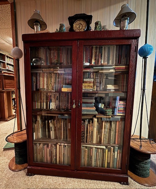
Peter Beilenson printed short run (usually less than 1000 copies) of interesting books from 1928 to 1962. Many of these books were slip cased. His wife continued with the company until she passed away in 1981. Other family members still continue to publish books under the name of Peter Pauper Press. What is interesting, is that on many of the books, on the last page, is printed the type of type, along with other printing information.
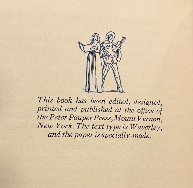

That is just another reason that Peter Pauper Press books are an integral part of my book collection. They are wonderful books. There was much care in exactly what type of lettering was in each book, and how that type would help reading the book, a little more enjoyable.
After I spent way to much time (not really!) just re-visiting books from the PPP bookcase, I thought “what type of people are interested in this type of books?” It brought me to another book, “People and Books: A Study of Reading and Book-buying Habits’ by Henry C. Link and Harry Arthur Hope, published in 1946.
This was a great study on book buying trends, and habits of various groups of people. It then has chapters on how to best market book-selling to different readers. The topic of eyesight causing less reading, went into the discussion of using types that were easier to read.
I then lastly went to “How to Improve Your Personality by Reading” by Francis Beuchesne Thorton, published in 1949.

This book is very thought provoking. The author describes different types of books, i.e. novels, poetry, autobiographies, science, drama, religion to explain the benefits of each category. He then gives a list with descriptions, of 1350 titles that he recommends, with a final 100 best list.
While I enjoyed the book immensely, I don’t think my wife would let me make a new shopping list of even more books to add to my library. Some of the titles are already here, but I would need another room for the type of collection he suggested I purchase. it was also a puzzling quote from the book “We require some large laughter regarding the Woolworthian ideas of personality.” The author did not like the discount, cheap sensational type books to read. He also reminded us that the “glaring colors of comic books will be tiring to your eyes as you grow older.” He wanted us to read better.
However, the author, Father Thorton, had to post an Addendum that was tipped in to the page leading to his lists. It said “The following books in the reading lists of “How to Improve Your Personality” are on the Index of Prohibited Books. They may not, of course, be read by Catholics without special permision.” This edict was presented by the church shortly after the book was published. There were fourteen books listed. I have four already. Perhaps I should buy the rest…
I would like to leave with a quote from Paula Scher, an artist and typographer:
“Words have meaning. Type has spirit. The combination is spectacular.“
The right type can certainly help with enjoying and understanding a book. Thanks for reading.
